beware of the kids!
a children friendly café, in need of a rebranding.
Role / Brand strategist & designer
Client / KEA
Industry / Hospitality
Deliveries / Strategy & visual identity
the visual starting point
Café “Sweet Surrender”
Their name and logo are the only consistent visual element across their touchpoints with the costumers. Other than that, it changes a bit from platform to platform, regarding their font use, colours etc. Their imagery is mostly food-oriented, showcasing their menu items. They don’t illustrate strongly enough that they are a children friendly café.
Summary
brief & problem
A complete rebranding of the café. – People are confused about the name, and it is not clear enough that it is a children friendly café.
Their level of awareness has been at a standstill for several years, and with more new competitors entering the market space, they are forced to create a more recognizable brand.
client (school case)
“Sweet Surrender” – A children friendly, non-profit café that wants to give all its visitors a break from the turmoil of everyday life by serving high-standard coffee and tea, affordable and with a warm smile.
insight
"My kids are a reflection of myself”.
As an extension of oneself, parents want to be able to identify with products and services for their kids.
solution
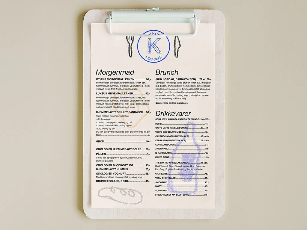
“A new “kids first” identity that clearly illustrates that kids are welcome at the café.
The playful elements are combined with otherwise minimalistic and Nordic-looking design elements, to ensure that the parents will feel like it’s a place they want to be at as well. It’s a clean looking kids café to support that they’d happily share stories on socials or recommend to friends.
identity


